Theme Support
IntroVox automatically adapts to all Nextcloud themes. No configuration needed.
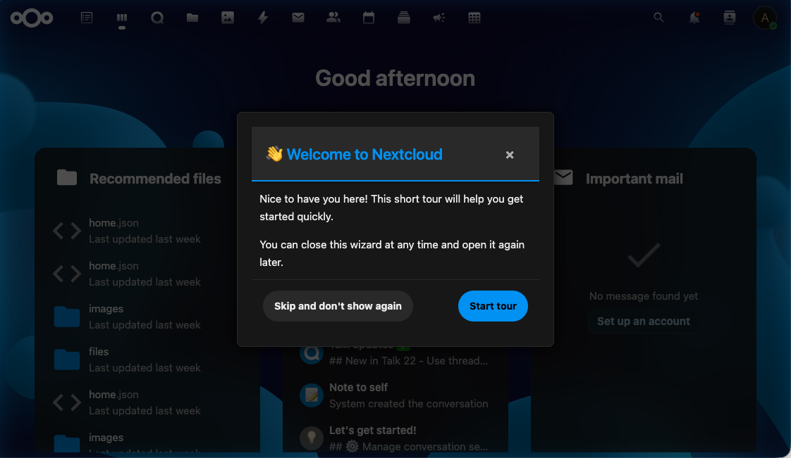
Supported Themes
- ✅ Light mode (default)
- ✅ Dark mode (via system preference or Nextcloud setting)
- ✅ High contrast mode (accessibility)
- ✅ Custom themes (via the Nextcloud Theming app)
How It Works
The wizard uses Nextcloud's CSS variables rather than hardcoded colors:
| Variable | Purpose |
|---|---|
--color-main-background |
Step background |
--color-main-text |
Body text |
--color-primary-element |
Accent (buttons, highlight borders) |
--color-border |
Step container border |
--color-background-hover |
Hover states on buttons |
Because these variables are scoped to the document and updated by Nextcloud's theming system, the wizard automatically picks up any theme change — including custom themes deployed via the Theming app.
Accessibility
Reduced Motion
If the user's system has the "reduce motion" accessibility preference enabled, IntroVox disables its animations (step transitions, fade-ins, overlay tweens).
High Contrast
In high-contrast mode, the wizard uses enhanced border widths and color contrasts to remain readable.
Keyboard Focus
All interactive elements have visible focus indicators that adapt to the current theme — they remain clearly visible in both light and dark modes.
Semantic HTML and ARIA
Steps use semantic HTML (<h2> for titles, <button> for actions) and ARIA labels where needed, so screen readers can announce content correctly.
Custom CSS
IntroVox does not currently support custom CSS overrides via the admin panel. If you need custom styling, you can:
- Use the Nextcloud Theming app to adjust global CSS variables (changes apply to IntroVox automatically)
- Deploy custom CSS at the Nextcloud level (via the Theming app's "Custom CSS" feature)
Avoid inline styles inside step HTML — they break theme inheritance.
See Also
- Customization — HTML, CSS selectors, positioning
- Keyboard Navigation — Accessibility features for users
- Architecture Overview — How the frontend integrates with Nextcloud's theming